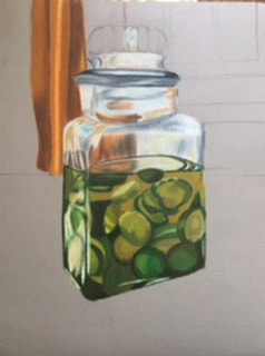
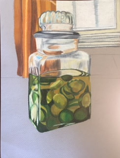
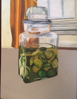
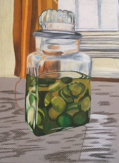
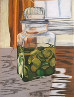
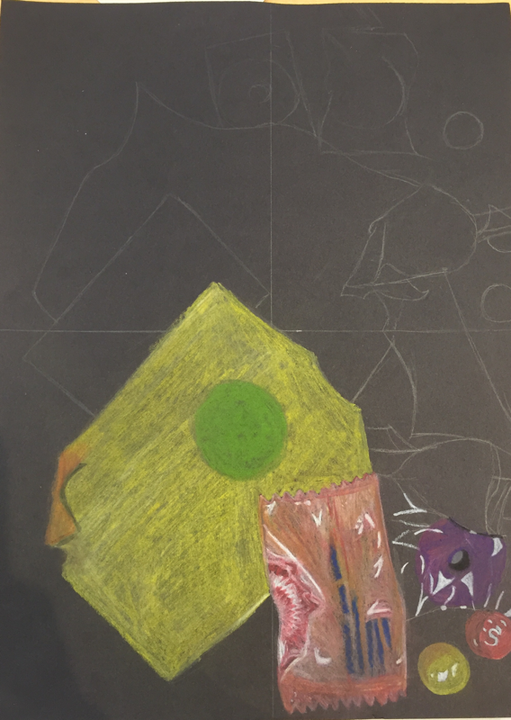
Describe the craftsmanship of your drawing. (Is it neat and well executed?)
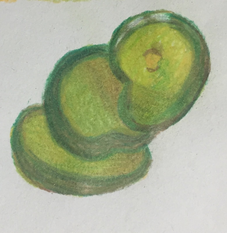
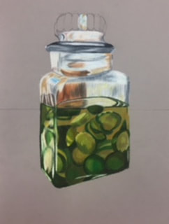
I think the craftsmanship of my drawing is neat and well executed. I spent a lot of time on this project and I've really improved since the first prisma drawing I did. I think its neat because I spent so much time on it and spent so much time in each area. I also think its well executed because I drew each detail first then layered it with prisma.
Describe your choice of colors/color harmonies and how you used them throughout the artwork.
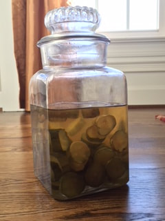
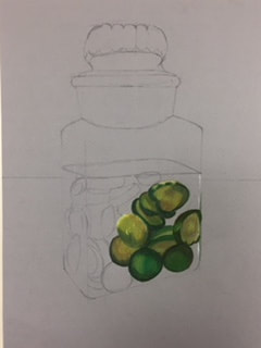
For the colors in my artwork I kept it realistic, every color thats in this piece is in the actual picture, however I did exaggerate some colors, theres a bit more white and blue in my piece then in the actual picture. I decided to follow the actual picture cause I wanted to make something realistic and I ended up making something realistic in my opinion.
How did you create contrast in your drawing?
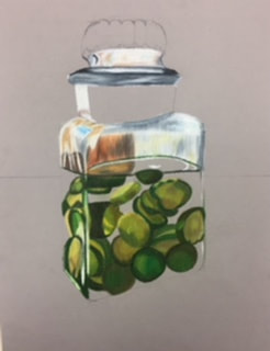
I created contrast through different variations of the same color. For example in the fabric I used browns and oranges in the areas where there was a shadow or it needed to be darker. Also in the pickles I used lots of different greens to create different colors in each pickle since they aren't all the same.
How did you use textures, highlights and shadows to enhance your artwork?
I had a textured paper which added to the textures but for the most part the textures of my artwork are smooth and I like it that way cause almost everything in my piece is a smooth surface. There was minimal highlights in my piece even though the object was opacity however my entire container and main focus is on the glass which has lots of shadows and colors in it. Theres a shadow underneath the pickle jar as well, however its not as noticeable as other shadows and highlights. This enhances my artwork because it makes the overall piece look more realistic and true to the picture.
Why did you choose a particular background color to mount your artwork?
For the background I chose the background in the picture, for a couple pieces I've just done a solid color or two solid colors, and for this jar of pickles I was really going for realistic so I decided to do the background of the actual piece. Also I kind of had to do the original background because of the glass and you can see through the glass the the distorted background.
Discuss the importance of understanding the media (prisma or pastels) and acquiring the skills necessary to create a successful project.
Its important to understand the media because it helps add to the piece, when you aren't familiar with a medium its harder to work with and get the piece to look how you want it to, also practice makes perfect so its best to practice multiple times before creating a final with a medium you don't know. For my piece one of the best skills in prisma is layering and I did lots of layering in my piece, which benefited me because it makes the piece look put together. The skills and understanding of the medium are important because with out them you aren't gonna create your best piece.
Describe any difficulties you had creating your drawing and what you could do to improve your drawing?
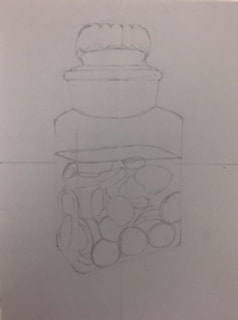
Some difficulties I had was getting the shape of the glass at the top, however I ended up getting the promotions correct and I love the way it turned out. I don't really think theres anything I could do to improve my drawing, which might sound cocky, however I just really like the way the piece turned out and I wouldn't change anything about it.
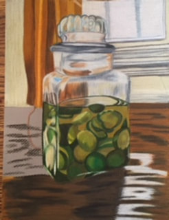
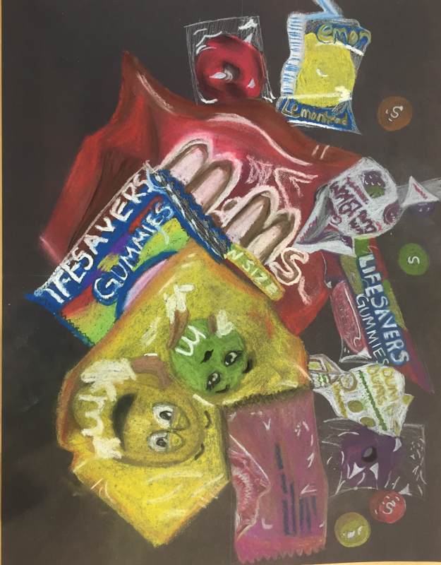
I think the craftsmanship of my drawing is neat and well executed. I spent a lot of time on this project and I've really improved since the first prisma drawing I did. I think its neat because I spent so much time on it and spent so much time in each area. I also think its well executed because I drew each detail first then layered it with prisma.
Describe your choice of colors/color harmonies and how you used them throughout the artwork.
For the colors in my artwork I kept it realistic, every color thats in this piece is in the actual picture, however I did exaggerate some colors, theres a bit more white and blue in my piece then in the actual picture. I decided to follow the actual picture cause I wanted to make something realistic and I ended up making something realistic in my opinion.
How did you create contrast in your drawing?
I created contrast through different variations of the same color. For example in the fabric I used browns and oranges in the areas where there was a shadow or it needed to be darker. Also in the pickles I used lots of different greens to create different colors in each pickle since they aren't all the same.
How did you use textures, highlights and shadows to enhance your artwork?
I had a textured paper which added to the textures but for the most part the textures of my artwork are smooth and I like it that way cause almost everything in my piece is a smooth surface. There was minimal highlights in my piece even though the object was opacity however my entire container and main focus is on the glass which has lots of shadows and colors in it. Theres a shadow underneath the pickle jar as well, however its not as noticeable as other shadows and highlights. This enhances my artwork because it makes the overall piece look more realistic and true to the picture.
Why did you choose a particular background color to mount your artwork?
For the background I chose the background in the picture, for a couple pieces I've just done a solid color or two solid colors, and for this jar of pickles I was really going for realistic so I decided to do the background of the actual piece. Also I kind of had to do the original background because of the glass and you can see through the glass the the distorted background.
Discuss the importance of understanding the media (prisma or pastels) and acquiring the skills necessary to create a successful project.
Its important to understand the media because it helps add to the piece, when you aren't familiar with a medium its harder to work with and get the piece to look how you want it to, also practice makes perfect so its best to practice multiple times before creating a final with a medium you don't know. For my piece one of the best skills in prisma is layering and I did lots of layering in my piece, which benefited me because it makes the piece look put together. The skills and understanding of the medium are important because with out them you aren't gonna create your best piece.
Describe any difficulties you had creating your drawing and what you could do to improve your drawing?
Some difficulties I had was getting the shape of the glass at the top, however I ended up getting the promotions correct and I love the way it turned out. I don't really think theres anything I could do to improve my drawing, which might sound cocky, however I just really like the way the piece turned out and I wouldn't change anything about it.
 RSS Feed
