In Art 4 I've made seven pieces and I'm currently working on my last piece, which is mixed media. Going into Art 4 I didn't know how to do a lot of things I should have known how to do like draw a face, and proportions, and use prismas, and use oil paints. However I didn't let that stop me I got really frustrated from time to time because I was use to working with just acrylic and Art 4 made me really branch out. I think I had a good semester in Art 4 some of the pieces aren't my favorite but that's ok, I noticed that the pieces that aren't my favorite are themes that I wasn't a fan of. I think when you have to make a project about a certain thing it's hard if you're not interested in it because you obviously aren't gonna spend as much time on it as a piece you're really into. For me I wasn't a fan of the reflection drawing, everyday object, and nature turns mechanical. I think part of it was what I chose for the project it wasn't something I actually enjoyed I just wanted to finish the project. I think that's one of the problems I run into in art classes, is that if I don't like the subject I just don't show my full potential and it's a flaw but I can't help it. I think if I were to redo those subjects now I would pick different things to draw/paint and I think I would have liked the subjects more. I think I grew a lot from all of my other art classes to now, I was also taking drawing this semester and I wish I had taken in sooner because it would have really helped in the beginning with Art 4, but overall I think I've grown a lot. When I walked into Art 4 I absolutely hated prismas, I didn't want to use them or do anything with them. However once I figured out how to use them I loved them I ended up making two really nice pieces with prismas in drawing, and I would definitely do more projects with them. The first project I did with oil paints I didn't like at all, I was so use to using acrylic paint that I was treating oil like acrylic and you can't do that, but after I did my self portrait in oil I really liked it. For the interior spaces project I had a really hard time drawing the shape of the bowl, if you look at the in progress pictures you can see how off it is, but I ended up getting the right shape and it changed the project completely. Once the shape was right it brought the piece together, when doing that project I had to color block and I had never done that before so it was really interesting and different. The pet portrait was the first pet portrait I've done I like everything about besides the background and when I leave Art 4 I plan on cutting it out, I really like the way the fur turned out in that piece though. It was the first time I drew fur and I really liked it. My self portrait was really interesting, I had never drawn a portrait let alone paint a portrait, when doing this piece I got extremely frustrated because half the time I didn't know what I was doing, this piece took me an extremely long time to finish and I think it turned out pretty good for a first portrait. My landscape piece was my absolute favorite piece I did it was acrylic which is my comfort zone and I wanted this piece to be perfect because it's a great memory for me. I also branched out by doing a different border and I love the way it turned out. Second to last piece was nature turns mechanical, I hated this subject and never want to redo it. I don't like this subject and I don't like the way my piece turned out and I didn't want to do this project in the first place which is probably another reason why I don't like it. The last piece were working on is mixed media, as of right now I don't have a plan for it but I love mixed media so I think it will end up looking pretty cool. Overall I really enjoyed Art 4 and if I were to take it again I would change some things but I think I really grew a lot from when I first started taking the class. And I think it was a great class to take and anyone interested in Art should take this class.
|
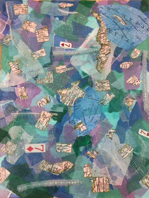
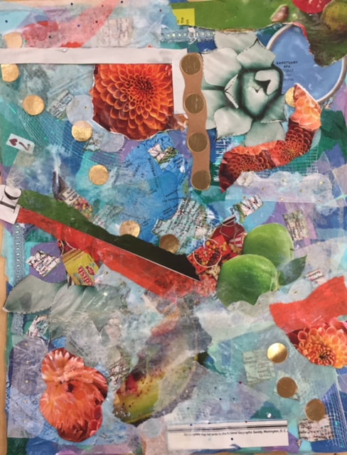
In mixed media theres really no planning you just add layers upon layers but then also make everything flow together. I haven't ever done a true mixed media with layering newspapers and not having a concept. I did a piece similar to this in Art 1 but it had a theme, this didn't have a theme so I was a little lost. I didn't really like the project mainly because you don't have any planning or have a theme or have anything to go off of, I've never worked on a piece like this so it wasn't my favorite. Luckily I got some help and Ms. Rossi saved my piece, she helped me figure out how to place things and how to make things blend and overlap but still make everything look smooth and make it look like it was meant to be pieced there. I'm still working on adding some more things but I don't have a plan for how much more I'm going to add. A lot was gained from this project because I didn't know what to do when I first started it but I learned how to place things properly and how to cover some things but also keep it seen. I like the way it turned out I had help which helped me a lot and guided me on what to do further. If I were to do this again, well I wouldn't, but if I were forced to I wouldn't go into with a theme which is what I was going to try to do but didn't end up working. So I wouldn't have a theme in mind and I would just pick a color scheme with contrasting colors to make some areas pop. Overall I really didn't like this project but I think it depends on the person and it was a fun thing to learn.
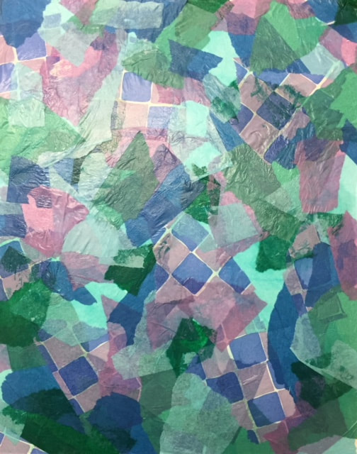
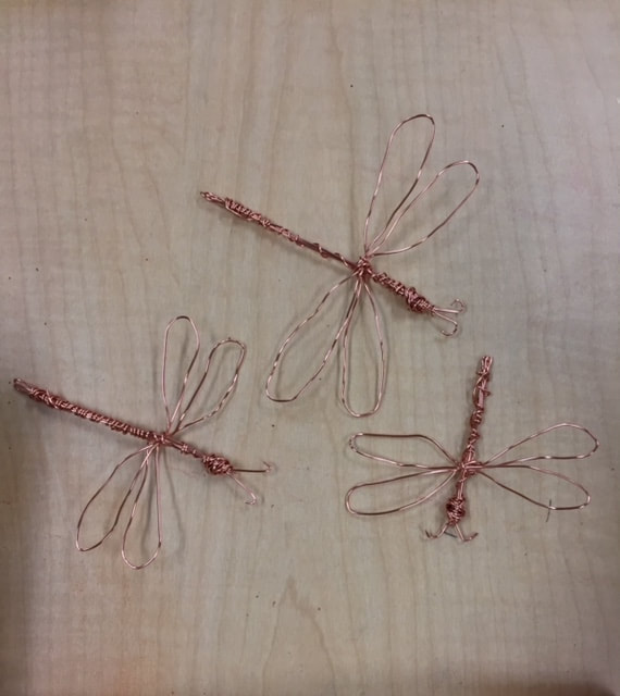
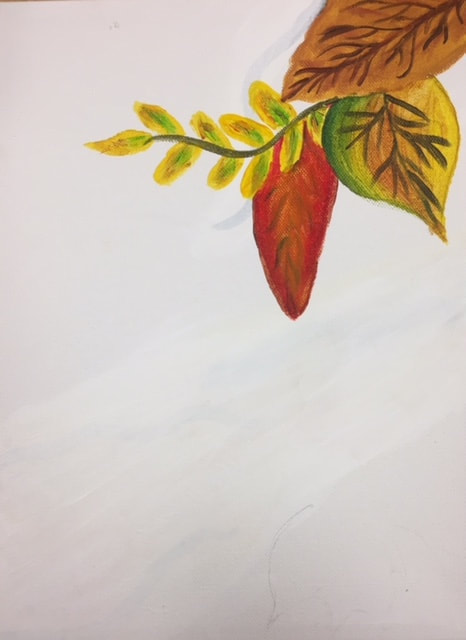
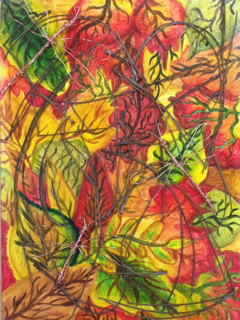
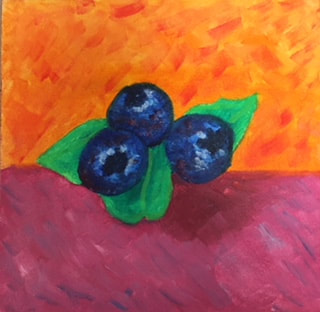
I didn't do much planning for this project, the original plan for this project was making a pine cone out of copper wire however I couldn't quite figure it out and I was trying to look up youtube videos on how to make it when i came across how to make a dragonfly out of copper wire. I watched the video and thought that it would be a better idea then mine. I kept the original idea I had for the canvas which was a forest floor painting with leaves then added real pine straw to make it look like a forest situation. Some obstacles I faced were getting the pine straw to stick to the canvas and getting the shape of the wings on the dragonflys. Getting the pine straw to stick was probably the biggest obstacle but I ended up getting it to stick, the original idea I had was gluing real leaves onto the fake leaves however when I got to the point of gluing stuff on I didn't have any leaves in my yard to grab for the canvas so I switched to pine straw. Overall I really like how the piece blends and it has a camo effect because lots of animals hide themselves in the forest so I like how the dragonflys are kind of hidden in the piece. I could have improved this piece by adding real leaves because I think real leaves would look better compared to pine straw but i still like the way the pine straw looks. Some things I gained from this project was learning how to use wire and mold wire to make objects. This has inspired me to learn more about molding wire for projects because its unique and looks interesting with it popping off the canvas. Obviously the more you use it the better you'll get and for this being the first time I don't think it's too bad. If i were to redo this project and do it differently I would use leaves instead of pine straw because I think it would look better that way all the leaves are different and there's different shapes. Overall I like the way it turned out, it isn't one of my favorite pieces i've made but I wasn't interested in nature turns mechanical so I was mainly just trying to finish the piece.
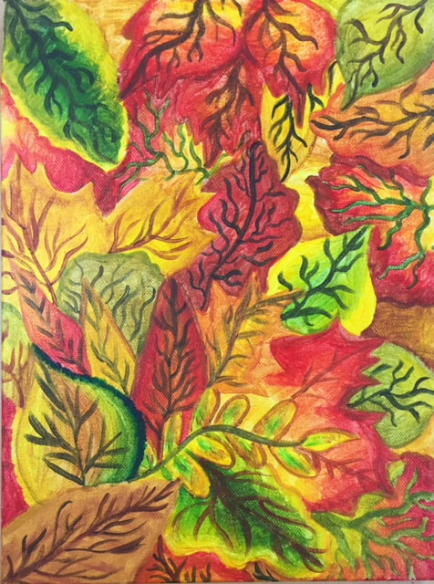
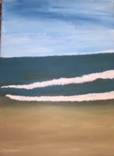
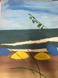
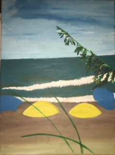
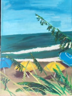
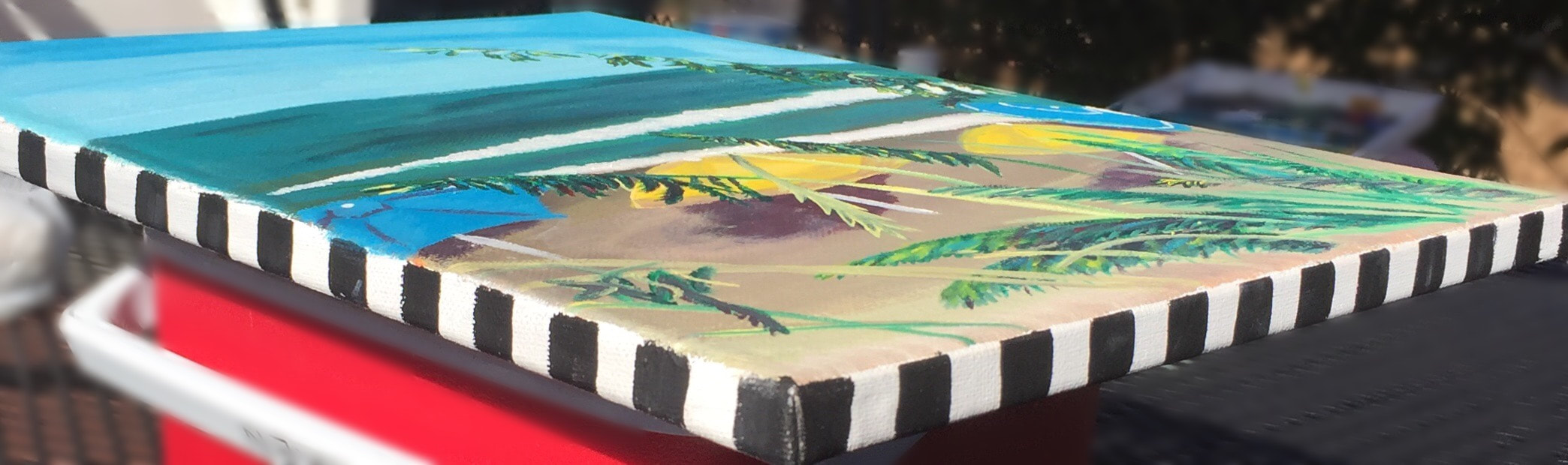
I had the idea to do a beach landscape because this picture means something to me and I thought it could be really interesting since I've never done a beach front scene. I didn't sketch this out because of the time we had to do the piece, however on the actual canvas I cut the canvas into eights so that I could map out where everything was. This piece was really fun to paint with all the leafs and I decided to use acrylic instead of oil so that I could paint the beach front background and then go in with greens, browns, yellows, and reds to the leafs so it looks like thats in front. I didn't really face any obstacles the umbrellas were a little hard to draw at first and get the shape but I ended up liking the way they look, the leafs add a lot of detail to the piece and I love the colors I got. Some successes I had were the border and the leads, I was able to get lots of colors in the leafs which I like and some are more detailed then others, I was a little pressed on time so the one I did first is my favorite because I spent more time on it, however, I still like all of them. I decided to do a checker border because I thought it added to the beach theme and I think it also looks interesting with the beach front. Something I could improve on would be more highlights and shadows in the ocean, but again this was the first time I've painted a beach front. I gained knowledge in colors with this project, I wouldn't have normally added blue or red into the leafs but overall it really adds to the look and makes it look more dimensional. It's inspired me to learn more about colors and adding colors I wouldn't normally use into a piece. If I were to do this again I would spend more time on the leafs at the bottom to make them match my favorite branch.
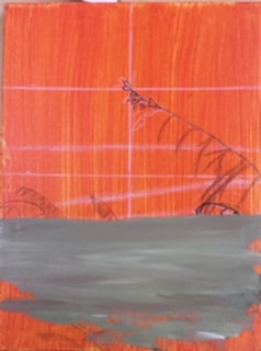
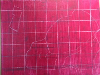
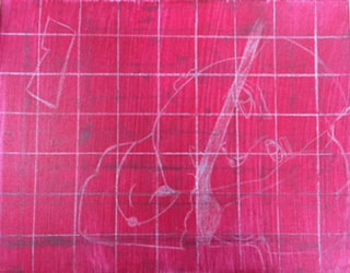
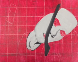
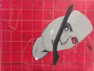
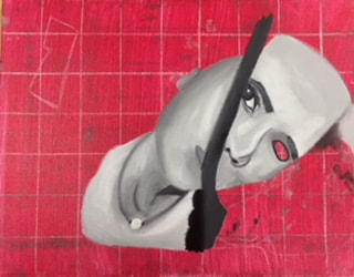
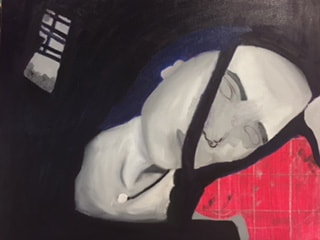
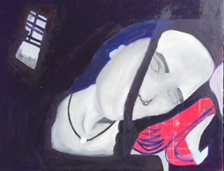
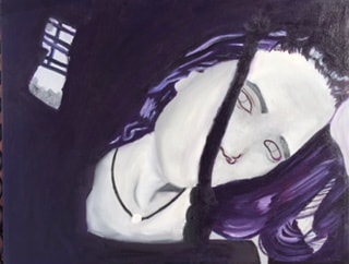
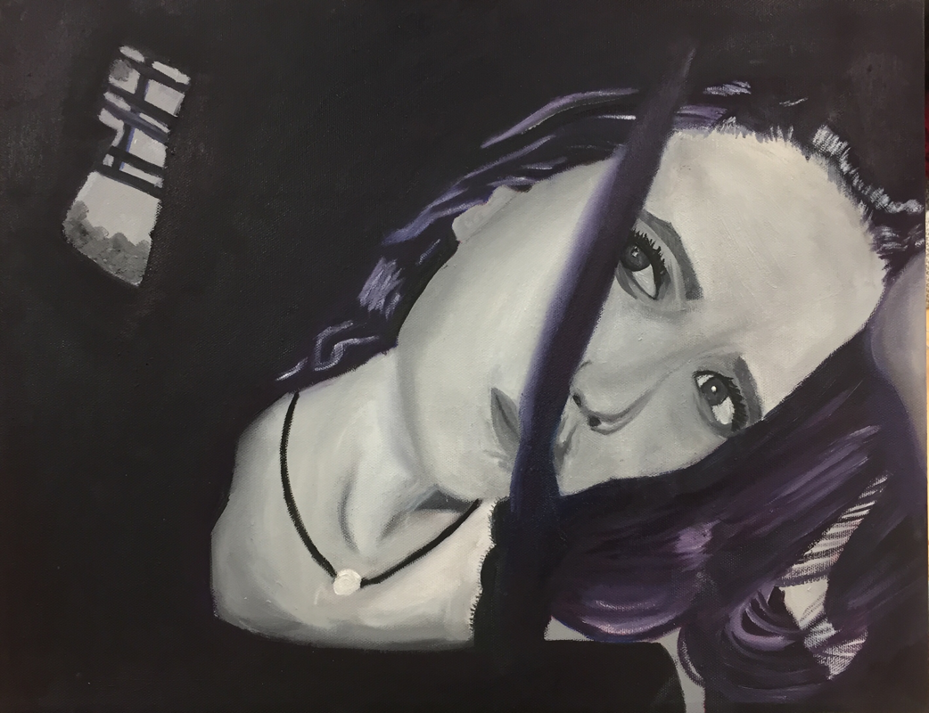
I came up with this picture when Ms. Rossi said we had to have dramatic lighting and shadows, when she said that my first reaction was to go into my parents closet in the afternoon because I Know the sun shines a lot through there. I was playing around with the lighting and shadow of the window and this is what I ended up getting. The picture was originally in color and I ended up switching it to monochromatic cause I liked the way it looked. For this piece I didn't do any sketching, I didn't do any sketching because of the amount of time we had and because I decided to grid this piece since I've never done a self portrait. Some obstacles I faced, well there was a lot, I've never really done a portrait the correct way, in art 2 I did a portrait but I didn't know how to draw a portrait so it was more of a practice than anything. I'd say the thing I struggled with most was the face. I don't know how to draw a face so I was suppose to grid it but it still wasn't correct, thats why in the pictures I have and I and then I had to redo it cause it wasn't proportional. At first I didn't know where to start with the hair and then I color blocked it and it ended up looking how I want it and I liked the purple highlights I think it makes the piece stand out and gives a different vibe rather than just normal black and white. Some success I had, I didn't have any at first, but now I like the piece, I'd say the hair, skin, and necklace was successful. I've grown a lot since my first portrait you can look back at art 2 and its pretty horrific, the proportions aren't correct and I didn't know how to draw anything, so I'd say I've improved a lot. How I could improve more is practice drawing faces so that I know how to when doing portraiture. This has inspired me to learn more about portraits. Im also in drawing class right now and were about to start portraits, so I'm looking forward to that and then I'll know how to draw everything correctly. If I were to do anything different it would be drawing a better outline of the face before I start actually painting.
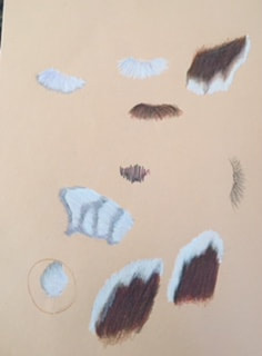
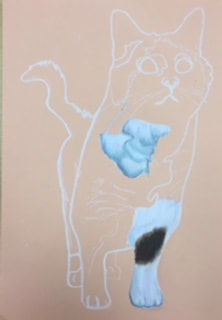
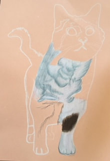
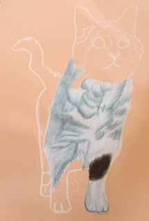
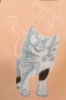
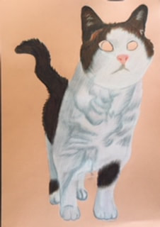
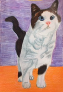
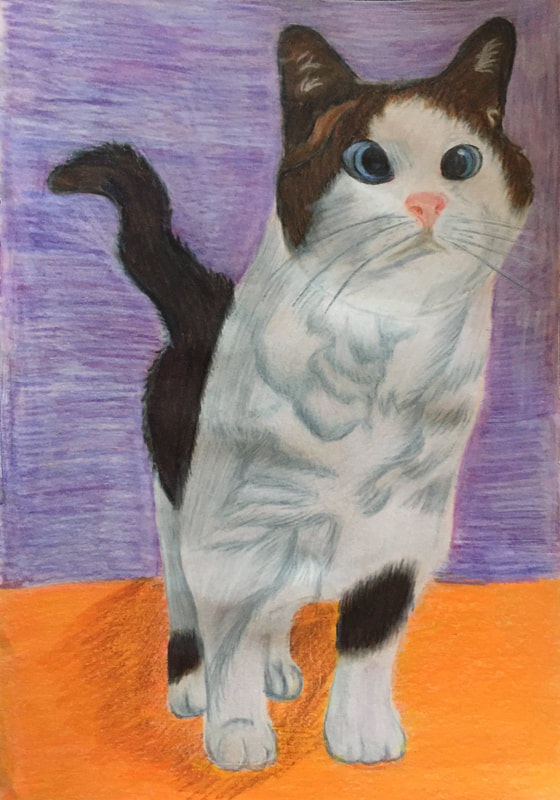
I have two pets, a cat and a dog, I decided to draw my cat cause I've never drawn fur and I felt like for a first time a cat would be easier than a dog. For sketches I didn't do much because we were short on time, for the sketches I played around with colors and how to get the shape of the fur, which took me a couple tries. Some obstacles I faced were the paws, I've never drawn paws and to be honest I don't really love the way they look in this piece but for a first time I'll take it. Another obstacle was the face, at first it was just white and then I had to go back and add more dimension to make it look more realistic, also the background was hard because I wanted to do normal colors for the background and it was hard to get a background around the cat. I think some of the success I had would be the fur, I really like the way the fur turned out with the colors and I tried to add more than just white to the fur but it doesn't show through that much because of the blending. Another success I think I had was getting the dark brown/black in the tail and some spots, I tried to not use black as much as possible and used browns, purples, and blues, and I really like the way it turned out. I think next time I could improve on the background and paws, the background was kind of spur of the moment and its a little textured and I don't know how I feel about all of it being textured. Also with the paws they just don't look realistic and I wish they did but it was a first time and there's always room to grow. I gained learning experience with prismas in this, I've never drawn fur so I had to draw that for the first time and it was interesting on how you do it with prismas cause you have to do each section separately. This has inspired me to do more with prismas, when I first started in art 4 with prismas I hated them and I think since I've figured out how to use them the right way, I'll do more pieces with prismas. If I were to do this piece again I would work a little slower and take more time on the background I would also practice the paws and eyes more before putting them on the final. Overall I like the way this piece turned out besides the background.
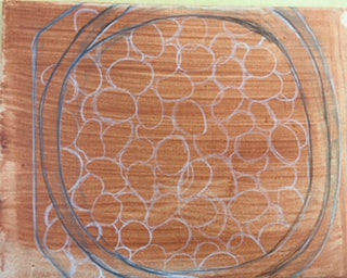
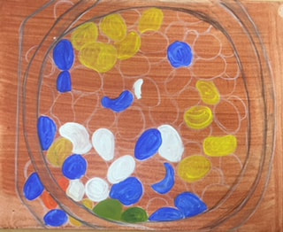
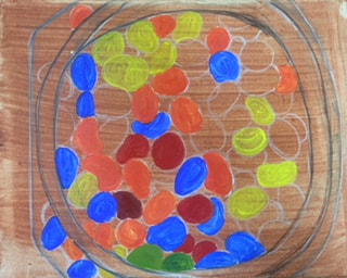
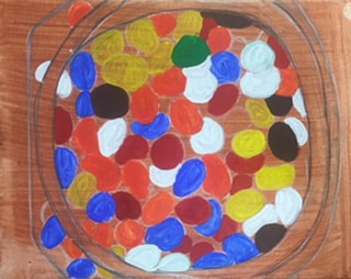
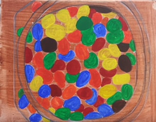
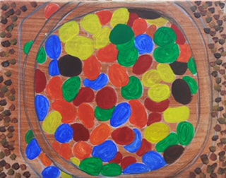
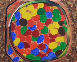
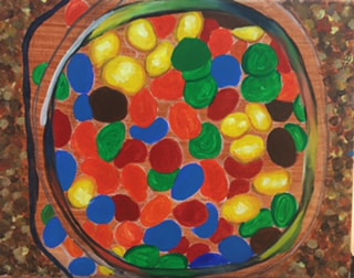
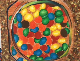
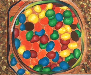
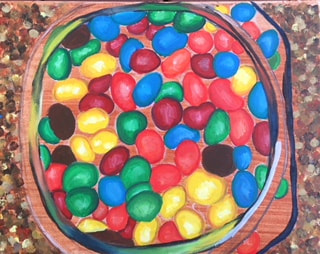
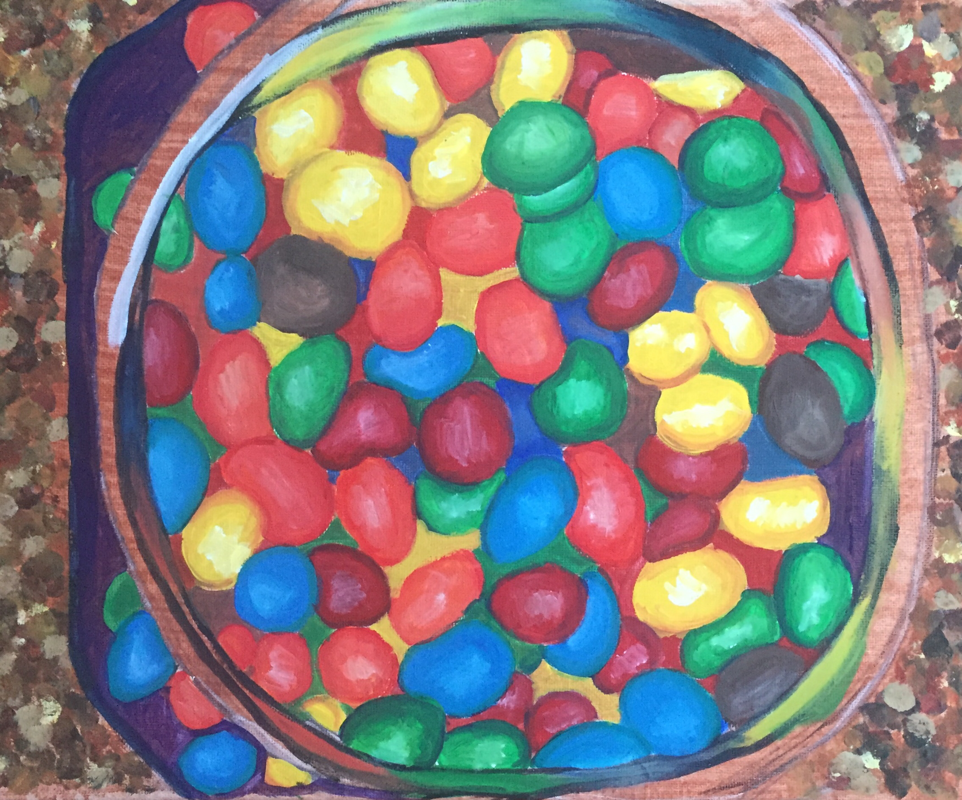
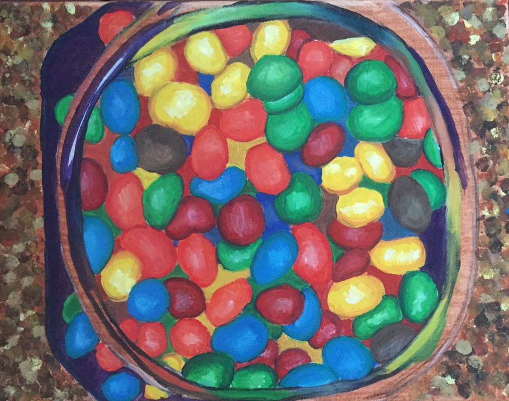
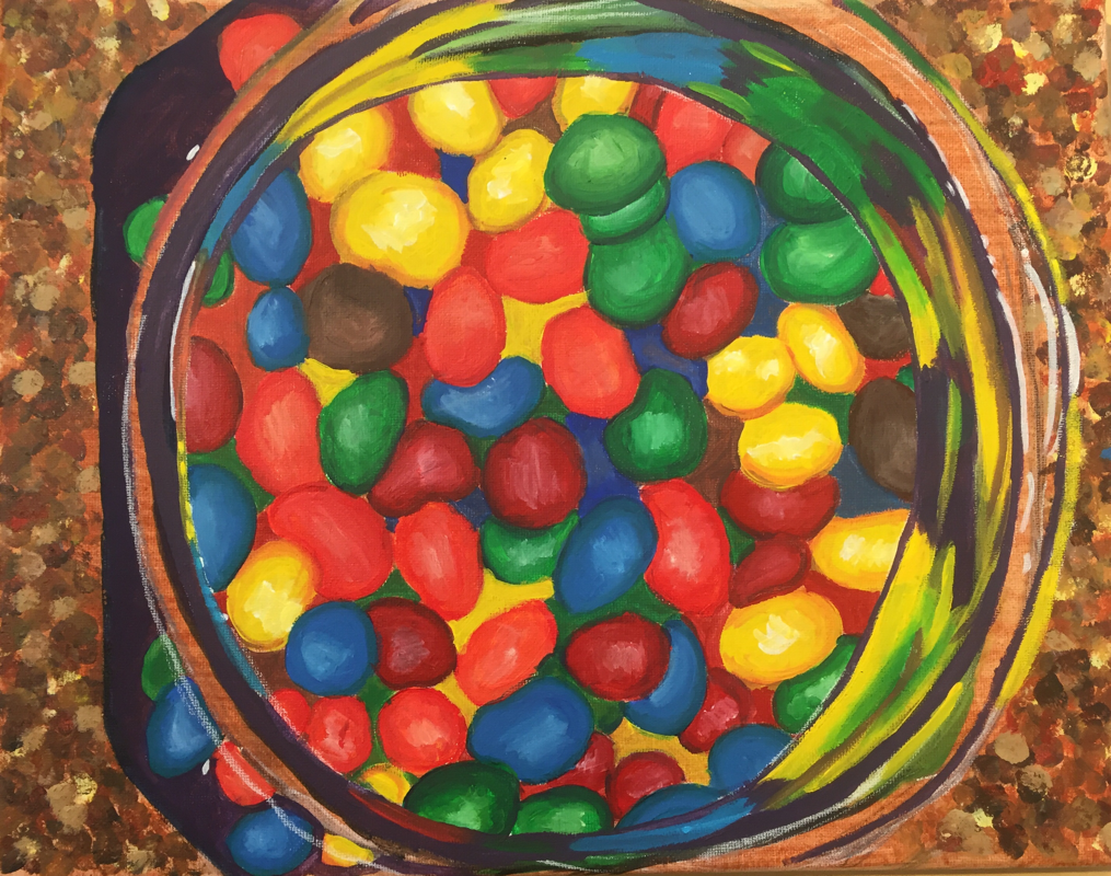
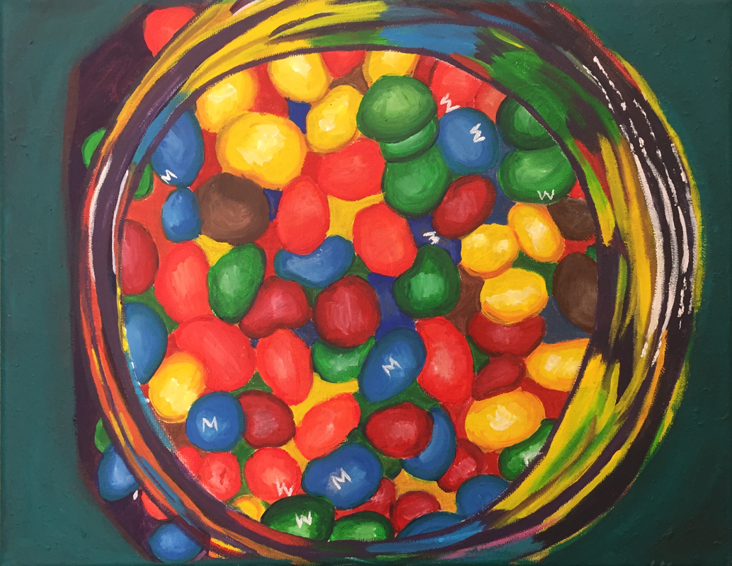
This idea was out of the blue, I thought it would be cool to draw a container of peanuts, however i was out of peanuts so i resorted to peanut M&M's. My other idea was to do a closet but I didn't think i would have the time to draw it, however I probably should have because I think it would have looked better than the M&M's. In the planning I did the M&M's in pen and I think it looked better than the paint, I also wasn't use to using acrylic so it took me some time to get use to it. My process was laying down a base color for all the M&M's then going back in and adding highlights and shading to each M&M. I then did the base layer for the granite counter top and still have to add to it. An obstacle I faced was getting the glass jar right, I drew glass for the first time a couple weeks ago and that was already pretty hard so to paint glass it made it even harder. I'm still adding highlights and shading and colors to make it look more realistic but it'll just take time to perfect painting glass. Another obstacle I faced was the background, and painting granite, I don't really like it and I still need to add more detail to it. One thing I think was successful was the M&M's themselves, I like the highlights I got with them and I also like the colors I got. One thing I need to improve on is time management and detail in the background, I think if I were to add more detail to the background it would make the piece pop more. I also need to improve on the glass because as of right now it still doesn't look like glass, however I do plan on fixing it and making it look more realistic. What was gained from my project was learning how to do shading and highlighting with acrylic paint, I don't think I've ever done that with acrylic paint and you have to work a lot faster than I thought you had to since acrylic drys so fast. This has inspired me to use more oil paints because I like the way they look and I like how you can work on them a lot longer than acrylic paint for detail and it's a lot easier to add detail to oil for me. What I were to do different if I did this project again would be draw the glass bowl differently and I would add more detail to the glass and granite so it looks more realistic. I would also find a way to add a shine to the granite so it looks realistic and add more highlights to the glass. Overall I think my piece is successful I ended up getting rid of the granite and adding a simple background, I then added more to the glass bowl to make it look realistic and I added the letters to the M&M’s. I really like this piece now that I’m done with it, also now that I’m done with it and I’m looking at it I might add more to the background since it’s very plain but other than that I like the way this ended up looking.
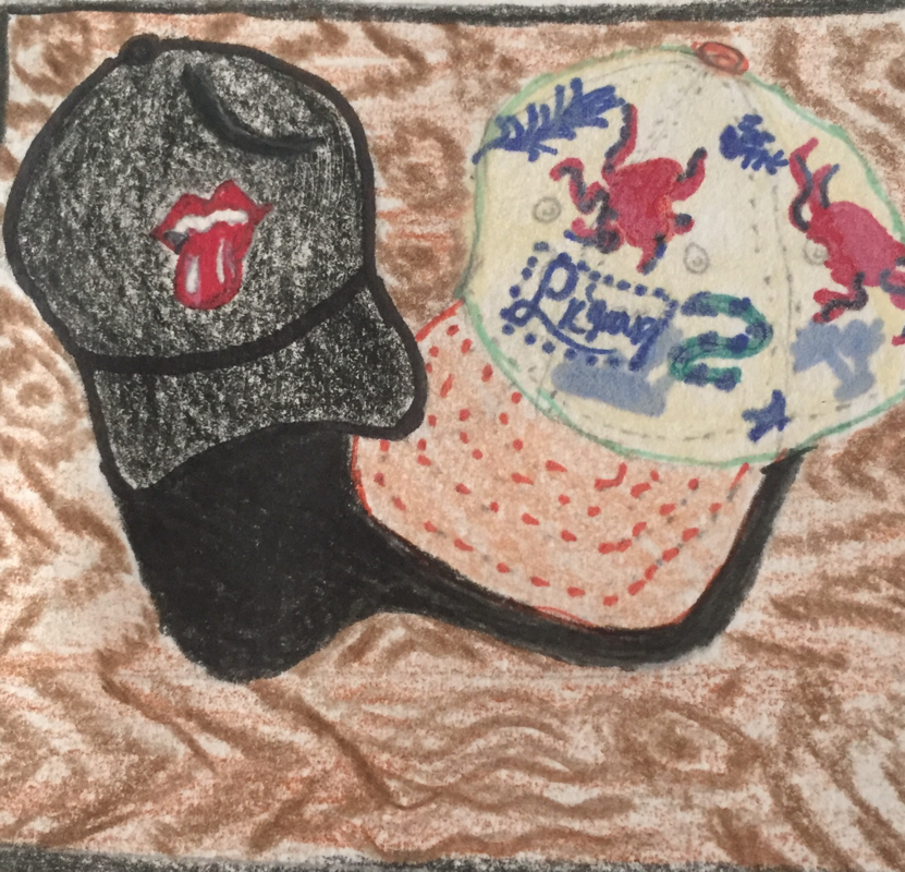
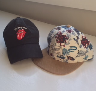
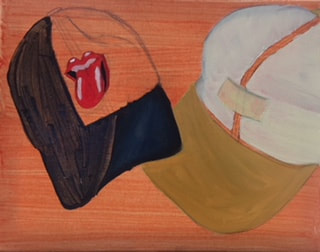
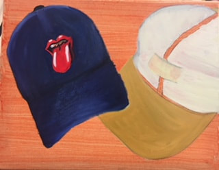
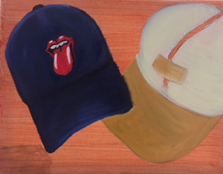
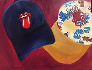
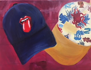
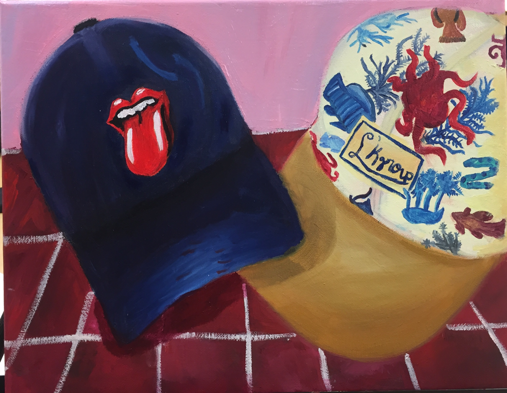
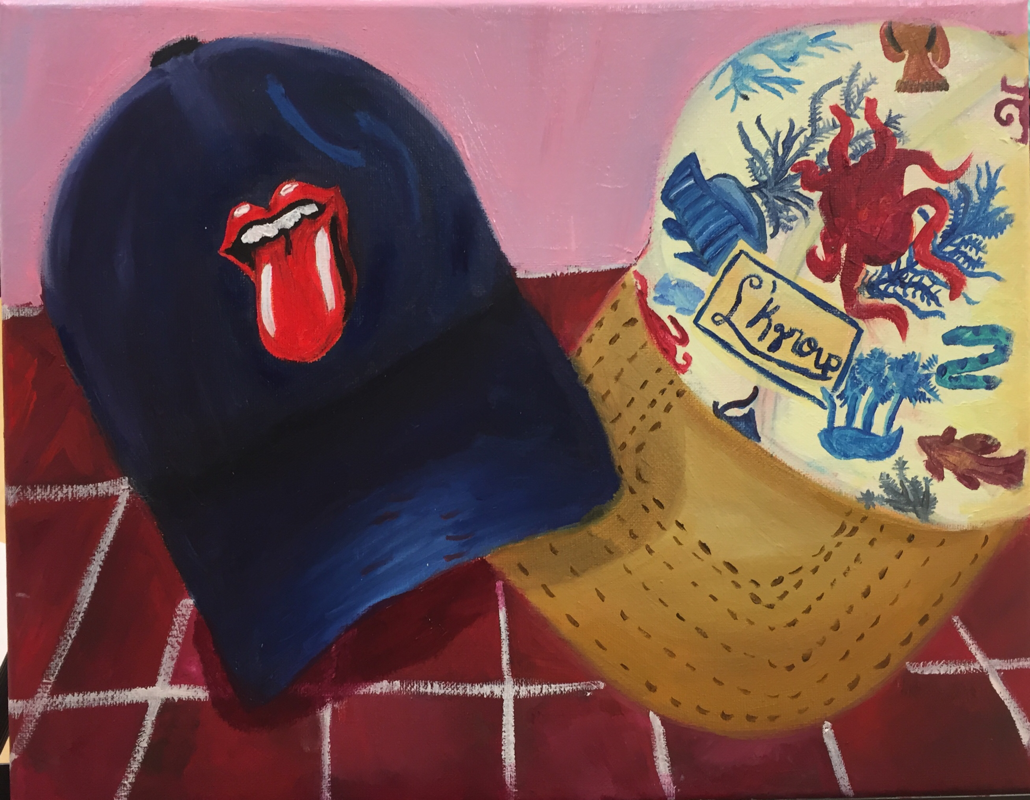
I got this idea by wanting to originally paint shoes, however I've already made a piece with shoes, so I then decided to do hats. Both these hats are my hats and they're two of my favorites. Originally I was going to do one hat then I was going to do three or four and I ended up with two. The rolling stones hat is my personal favorite, the hat is black however I used shades of blue and red to get a black vibe. The cream hat was the hardest, it was really difficult to get shading in the hat and all the details on the hat took a while since oil paint takes so long to dry. The benefits of planning and sketching for me was deciding how many hats to do, and what position I wanted the hats to be in. I went with two because I liked these two the most over all them and I liked the picture that I had of the two of them together. Originally the background for the piece was white and I decided to have the hats sitting on a brick landscape and a flush pink background. I didn't want white and I thought the maroon and pink would look best for a background since I used so much blue, white, red, and tan in the hats itself. Some obstacles I faced were getting the textures of the hats and the shading of the hats, it was a lot harder than I intended it to be, however overall I really like the way the hats turned out. I do have a favorite because I spent more time on the rolling stones one compared to the marine one. Another obstacle I faced was not using black, black is a flat color however the rolling stones hat is black, so I improvised and used shades of blue and red to get a black vibe, I know its not black but it's as close as I could get and overall I really enjoy the way the hat looks. I think I was successful on the drawing itself and the painting, I wish I had better time management for this piece because I ended up spending the majority of the time on one hat, so the other is a little flat and not as detailed as I'd like it to be. One thing I need to improve on with painting is adding colors that you don't see but you know belong there, its hard for me to add colors to a piece when you don't actually see them in the picture however adding these other colors gives dimension to the piece and makes it look more realistic. I also could improve on the proportions on the right hat, I think the proportions are a little off and I wish the top of the hat mixed the lid more. I gained experience from this project, this was the first time I ever made a final piece with oil paints. I liked them a lot more than I thought I would and I like how you ca blend out the colors so nicely. I also gained skill with blending paints and creating colors for these hats. This has inspired me to learn more about oil paints because in Art 3 I never really gave them chance since I liked acrylic so much, but after giving them a chance I really like the way my piece turned out and I enjoyed using them. If I were to make this piece again I would change the proportions on the right hat and try to add more shading than I did. I think for the first time really using oils I did a good job and I like the way it turned out.
This was my first time really using oils, I had experimented with them before but didn't know how to use them. Personally I liked using the pallet knife more, however the colors were more likely to get muddy for me, I also really liked the texture you can get with the pallet knife compared to brushes. The brushes were a bit difficult for me because the paint takes so long to dry , but it's all new and overall I really liked using the oil paints for the first time.
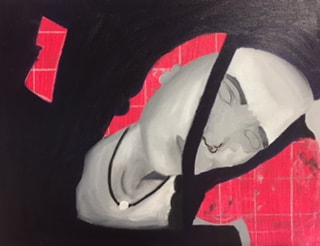
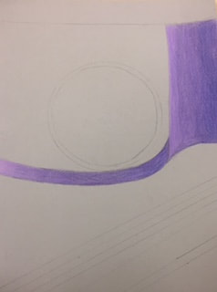
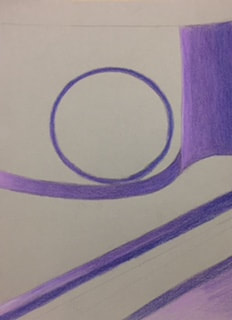
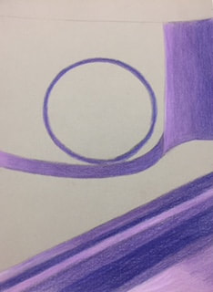
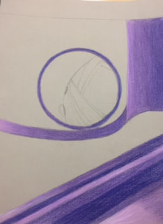
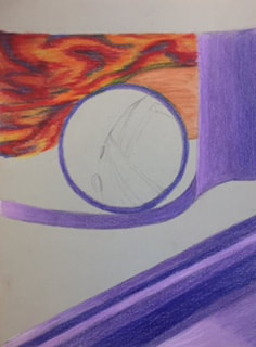
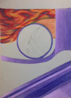
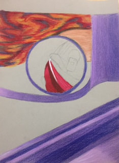
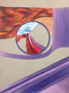
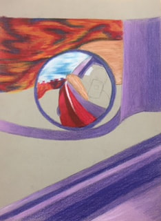
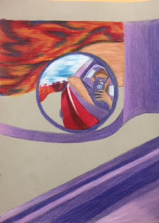
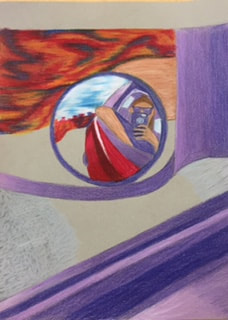
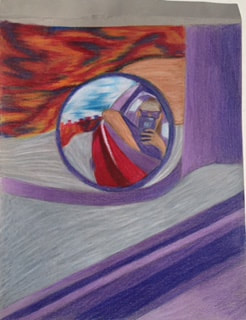
My idea was a spur of the moment idea, I was picking my sister up from school and was in the carpool line and thought it would be a cool picture. Although before this happened I knew I wanted to draw something related to my truck because it reflects me since its my vehicle and its probably my favorite thing I own. When I was sketching I had a couple other pictures I could draw of my truck, however some of them I wasn't in and some of them my face was covered. I ended up cropping the original picture and then drawing it almost exact. Also when I was planning I knew I didn't want to use realistic colors and I wanted it to have a color theme of reds, oranges, yellows, and purples. Some of the obstacles I faced was drawing the blurred background, in the picture the blurred background was trees, but I didn't want to use green or so I decided to switch the green out for blue, red, orange, and yellow. It was difficult to get the shape of the trees and then replace the colors because I just had to picture what it would look like. Another obstacle I faced was getting the shades of purple darker, I still don't think they're dark enough and could be darker but I did the best I could. Some of the success I had was the background, I love how trippy it looks and how it turned out. I also love the sky inside the small mirror it gives the other background a break and makes the mirror pop even more and gives it a little bit of a realistic vibe with the bright sky. I also think the drawing of the car mirror was successful, the car mirror was originally black and I decided to switch everything that was black with purple because I liked the color and it was easier to get values with shades of purple. The only things that are realistic colors in my drawing are the truck, concrete, and blue sky; I think by having these few realist elements it adds to the piece and gives the piece more definition. This is only my second time working with prismas and I liked them more this time, however they still aren't my favorite medium, but I did gain skill from them and I now know how to use them properly and how to build up the pigment. I also gained experience with working with a new medium and I ended up liking it more than I thought I would because I didn't like it the first time I used prismas. Its inspired me to use prismas more since I now know how to use and I've learned to take my time on pieces, this piece took me a lot of time and I normally rush through pieces which makes them not look as good as they could. If I were to redo this piece I would make the shades of purple darker to that it has more dimension and I would draw my face differently. In the face my ears are too high and I don't like the hair or the hairline, I would also make the sunglasses look more realistic. Overall I really like the way my piece turned out and I think it was successful for my second time using prismas. I also think after doing this project I would use prismas again.
|
AuthorWrite something about yourself. No need to be fancy, just an overview. Archives
January 2018
Categories |

 RSS Feed
