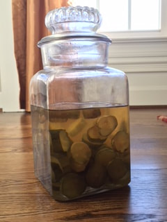
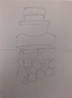
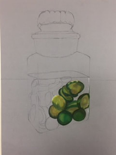
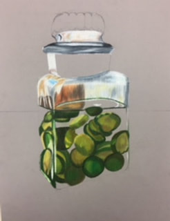
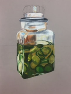
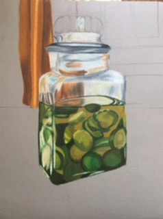
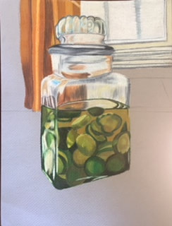
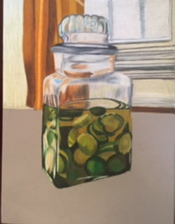
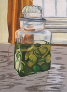
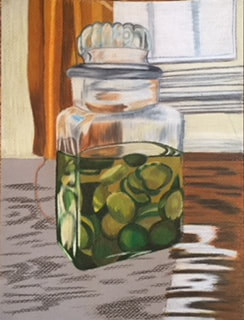
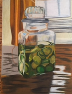
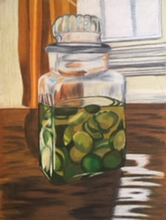
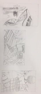
When I first started drawing class, I really didn't like it and I didn't like that we had homework, but drawing class taught me a lot of new techniques and helped me a lot with improving my skill. When I first started drawing my drawing skills weren't that great and with all the practices and projects we did they improved a lot. Two of my favorite pieces were made in this class, my two favorite were the chick-fil-a french fries and the jar of pickles. These were both done with prisma and I love the way they turned out. I've grown a lot with prisma and I think that's one of the reason I enjoyed drawing was because I got to learn how to use prismas the right way. I also learned how to draw portraits which I've never done before and that was interesting but I grew a lot and learned how to do each part of the face separately. Walking into drawing I only took it because I wanted to get out of Interior design, I was really busy a lot of the time cause during this class I also had Art 4 so I had lots of projects going on at the same time but it ended up being fine and I enjoyed both classes. I met some new people I normally wouldn't talked to, and I loved sitting at my table because I could talk to them and still get things done at the same time. In drawing I didn't like working with charcoal and graphite but I loved working with prismas, In the class next time I would give more prisma options because I really enjoyed them and wish I could have done other pieces in prismas. The first highlight drawing we did was a ribbon drawing this was when I learned that I didn't like drawing highlights instead of values. We did the fabric drawing next, and I personally think I was terrible at it, to me it doesn't look like fabric but it was a learning process. Next was still life, I liked my still life before I made it darker and the pinwheel is my favorite about it, but it helped me learn how to shade everything properly. After still life was foreshortening, this was one of my absolute favorite pieces, I loved working with prismas and I love how this piece turned out and I thought it wouldn't be as good as it was. After foreshortening it was opacity, for this I drew a jar of pickles also in prismas and also loved this piece, the glass and background turned out so much better than I expected and and I learned how to properly draw glass. Next was self portrait, this I really didn't like I think part of it was the picture I had and I also switched between charcoal and graphite a little too much, I liked the one I did in oil much better. After was scratchboard and I liked it but I wish some areas were better. Overall I grew so much from when I first started to now and I'm really proud of myself for how much I've grown and I've also learned what mediums I like to work in.
|
1. Describe the subject matter and meaning of your artwork.
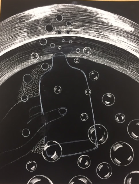
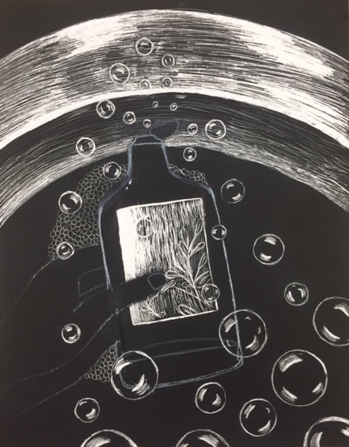
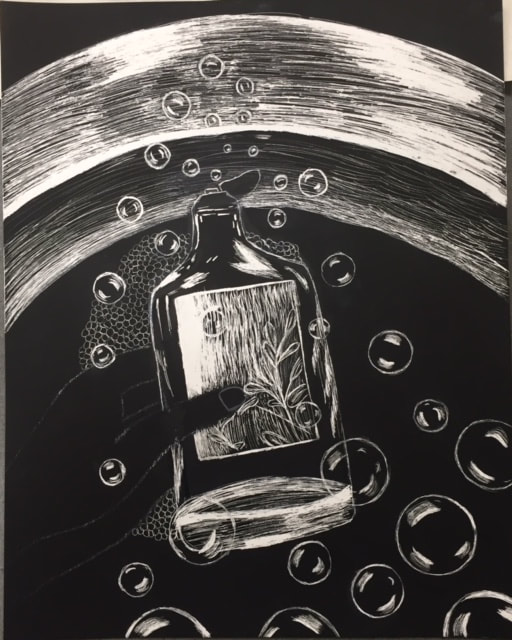
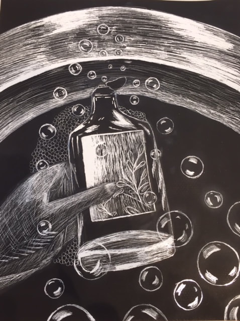
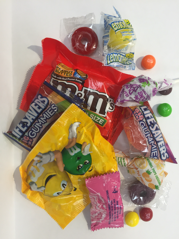
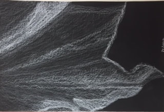
I decided to do a bubble bath container and a sink with bubble because I really wanted to do bubbles on scratchboard and I was trying to think of ways I could put bubbles on a scratchboard. At first my two ideas were separate, I was going to do a bubble bath with lots of bubbles or just a container with bubbles coming out of it. I ended up putting both together and I like the way it turned out. 2. How did you use textures to enhance your picture? In the picture I did semi circle motions to get the texture in the sink with bright highlights, for the bubbles I added small highlights with the highlights fading out on either side. For the hand I did cross hatching and it turned out okay, I wish it was better than it turned out, but it was the first time doing a hand with highlights instead of shading and I just went for it. 3. How did you balance your artwork and create a well-organized composition? I balanced my artwork by having some things go off the page and then other things being on a full page. I like the composition and I think everything turned out fairly well besides the hand. If I were to redo it I would fix the hand and I would also draw the bottle a little differently, it ended up being a little better than I wanted it to be but I still really like it. 4. How did you imply movement in your drawing? I implied moment in my drawing through bubbles, I wanted this to be the main thing in my piece. To imply the movement I made the bubbles different sizes, had them going on and off the page, and over the bottle and my hand. I love the way the bubbles turned out they might not be as realistic but the whole piece isn't really realistic, this was my first time doing scratchboard and I didn't really like it because I don't like doing highlights over values. 5. How could you improve your artwork? I could improve my artwork by spending more time learning how to do the hand and also realistically shaping the bottle, I think that if those two were better the entire piece would look more realistic and overall better. Another thing I could improve on is doing more textures than I have, I really only have two textures besides basic shading and it might look better if there were more. 6. How did you demonstrate a wide range of shading values? I demonstrated a wide range of shading values mainly in the sink, theres lots of midtowns but also bright whites and also a banner of just black to separate the two sides. Theres also bright whites in the bubbles and then midtones fading out from each highlight. Also the main background is black which I like because it separates the piece and I think makes everything pop. Explain the process you went through to develop your drawing.
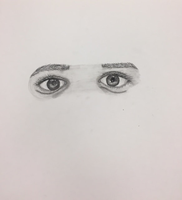
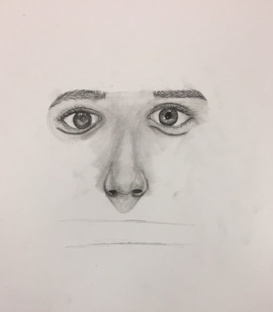
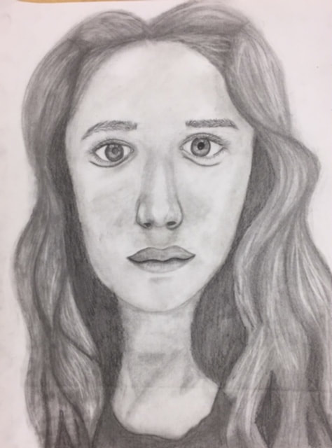
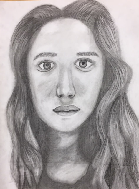
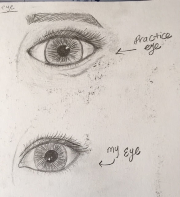
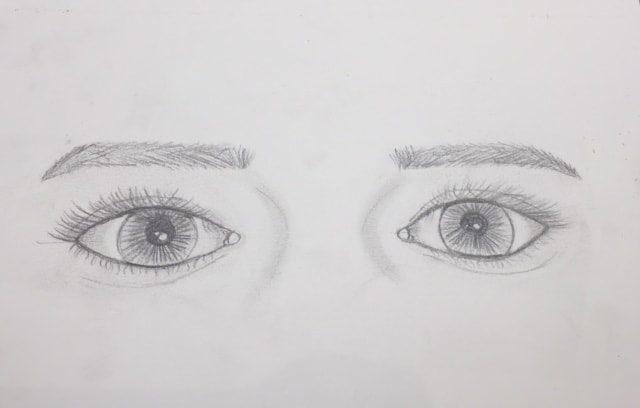
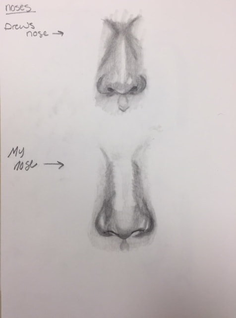
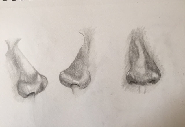
I decided I wanted to have a picture that didn't show any emotion that way I could learn to draw my features without any emotion. I decided to just look straight into the camera and take a picture with my hair in my face. I wanted to keep my hair because it kinda defines me and helps you realize that its me since its wavy/curly. Explain how you found the different values in the portrait? I found values by making my hair dark and the values around my neck were darker because in the picture they're pretty dark. Because we didn't have any major lighting there wasn't really any dramatic shading or lighting so I made the face as shaded and highlighted as i could without it being too much. Did you achieve a full range of the different values within your portrait? How? I think I did achieve a full range of values because I have the dark darks in the neck and I have the lights in the face, there's also lots of midtones in the face and hair, while at the same time the hair has darks and lights. I think some of the areas could have been darker but I got the charcoal as dark as I could. Overall I like the highlights and shadows I got in the face and the hair. Describe your craftsmanship. Is the artwork executed and crafted neatly?How were you able to capture your look? This was the second time I've done a self portrait but this is the first time I've done a drawing portrait, I think its crafted neatly for the first time drawing a self portrait. obviously practice makes perfect and my first drawing portrait isn't gonna be the best thing in the entire world. I was able to capture my look through making it as close to the picture as i could. I think something is still a little off with it but I cant exactly tell what it is. Explain how you made sure you had correct facial feature placement. I used the eye technique, so each feature is a certain amount of eyes down or up your face. I think this works well for a generic face but for your own face not everything is symmetrical like a generic portrait. I used the eye technique on the picture and marked where everything was based off my eye then transferred that to the actual drawing. Explain the importance of learning how to draw all the features individually. It's important to learn all the features individually because you learn the generic shape of each feature and then you edit the feature to fit you and your face. With learning the them individually it helps get the correct genetic shape so that its easier to edit them to your face. What part of this unit was the most beneficial and why? Learning each step separately and them combining them all together. I think this was the most beneficial because it helps you figure out what each feature is suppose to look like and then you take your own features and learn how to draw them individually and all the shading then when you combine it, it makes it so much easier because you know what it's suppose to look like. List any obstacles you had to overcome and how you dealt with them. Hair was an obstacle, we didn't learn to draw in individually we just went right into it so it was hard to figure out. The first section of hair i ended up erasing because it didn't look realistic or have the right movement. This was the first time drawing eyes in drawing class, however I've drawn eyes before but not the correct way, so it was nice to learn how to draw eyes and draw them the correct way. I've never drawn a nose before the correct way and with complete shading so it was nice to learn how to do that. I've also never drawn a nose from the side and I really like the way it turned out, it was also interesting to draw it from the side and not the front. 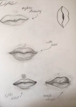 Lips for me are the hardest besides eyes, I don't really like the way they turned out, I think most of my practices don't look realistic, so I still have some learning to do and learning to shade them properly.
Describe the craftsmanship of your drawing. (Is it neat and well executed?)
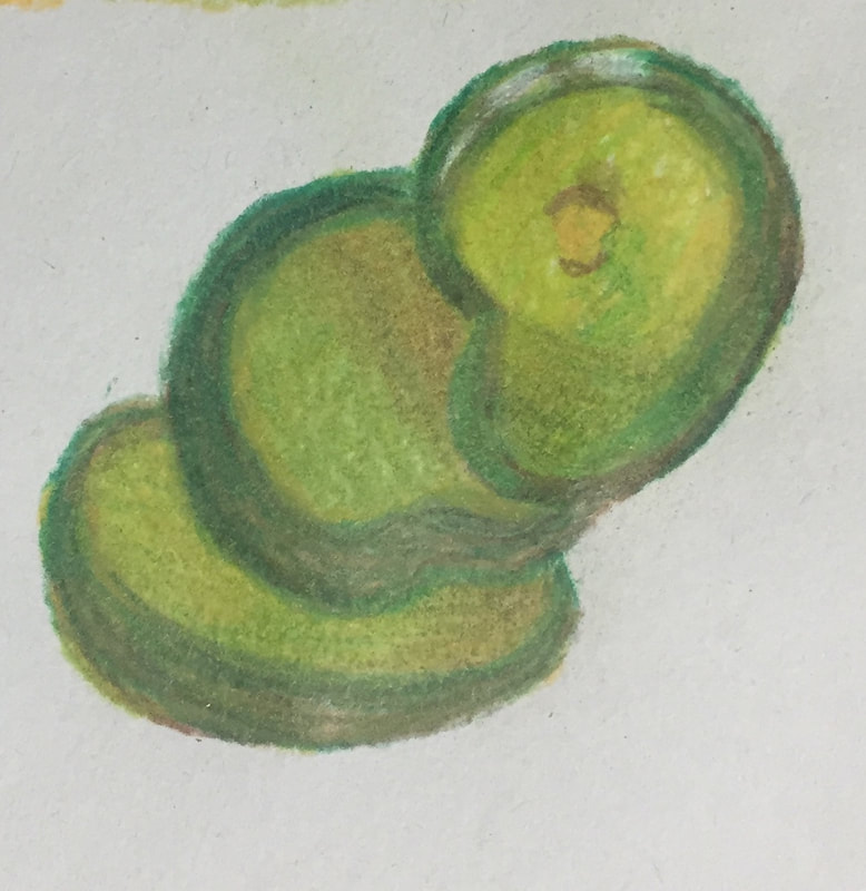
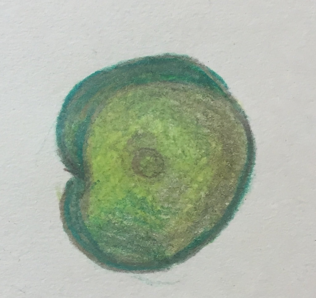
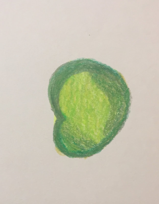
I think the craftsmanship of my drawing is neat and well executed. I spent a lot of time on this project and I've really improved since the first prisma drawing I did. I think its neat because I spent so much time on it and spent so much time in each area. I also think its well executed because I drew each detail first then layered it with prisma. Describe your choice of colors/color harmonies and how you used them throughout the artwork. For the colors in my artwork I kept it realistic, every color thats in this piece is in the actual picture, however I did exaggerate some colors, theres a bit more white and blue in my piece then in the actual picture. I decided to follow the actual picture cause I wanted to make something realistic and I ended up making something realistic in my opinion. How did you create contrast in your drawing? I created contrast through different variations of the same color. For example in the fabric I used browns and oranges in the areas where there was a shadow or it needed to be darker. Also in the pickles I used lots of different greens to create different colors in each pickle since they aren't all the same. How did you use textures, highlights and shadows to enhance your artwork? I had a textured paper which added to the textures but for the most part the textures of my artwork are smooth and I like it that way cause almost everything in my piece is a smooth surface. There was minimal highlights in my piece even though the object was opacity however my entire container and main focus is on the glass which has lots of shadows and colors in it. Theres a shadow underneath the pickle jar as well, however its not as noticeable as other shadows and highlights. This enhances my artwork because it makes the overall piece look more realistic and true to the picture. Why did you choose a particular background color to mount your artwork? For the background I chose the background in the picture, for a couple pieces I've just done a solid color or two solid colors, and for this jar of pickles I was really going for realistic so I decided to do the background of the actual piece. Also I kind of had to do the original background because of the glass and you can see through the glass the the distorted background. Discuss the importance of understanding the media (prisma or pastels) and acquiring the skills necessary to create a successful project. Its important to understand the media because it helps add to the piece, when you aren't familiar with a medium its harder to work with and get the piece to look how you want it to, also practice makes perfect so its best to practice multiple times before creating a final with a medium you don't know. For my piece one of the best skills in prisma is layering and I did lots of layering in my piece, which benefited me because it makes the piece look put together. The skills and understanding of the medium are important because with out them you aren't gonna create your best piece. Describe any difficulties you had creating your drawing and what you could do to improve your drawing? Some difficulties I had was getting the shape of the glass at the top, however I ended up getting the promotions correct and I love the way it turned out. I don't really think theres anything I could do to improve my drawing, which might sound cocky, however I just really like the way the piece turned out and I wouldn't change anything about it. This was my first time using chalk pastels, overall I don’t really like them they’re very messy and hard to layer. I think my practice turned out ok, I think it could be better but I couldn’t layer anymore without more chalk falling off. I don’t think I would use chalk pastels again unless I had to however it was fun to try a new medium.
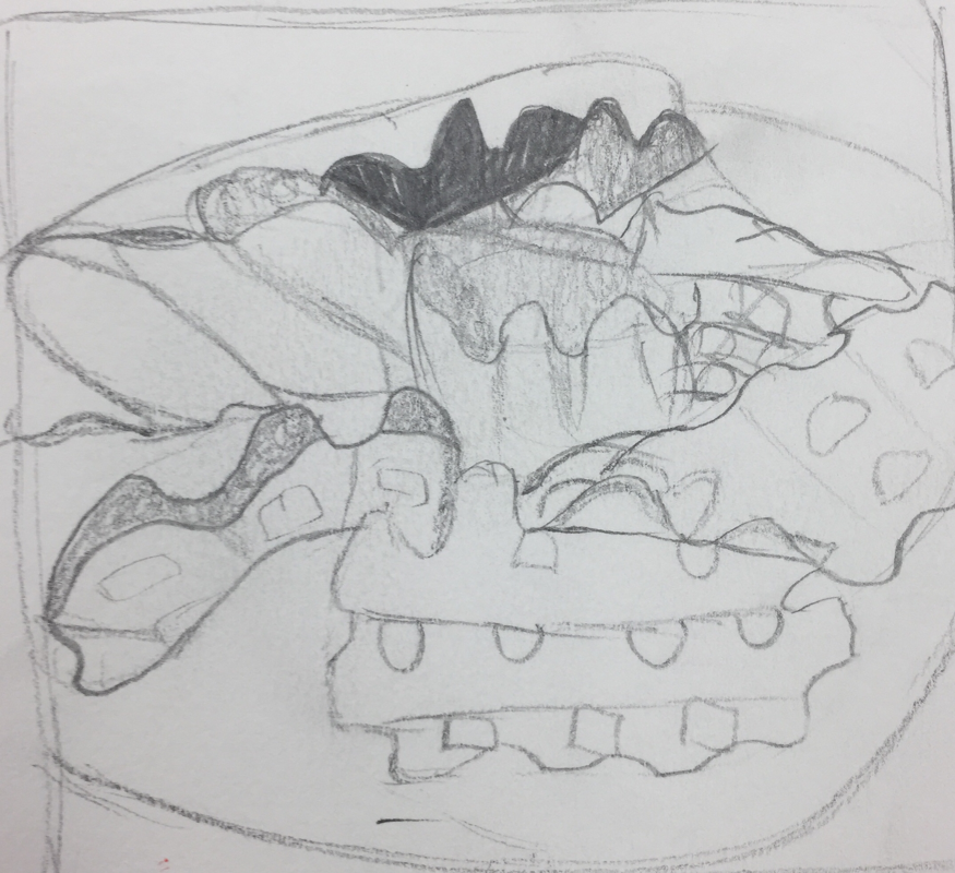
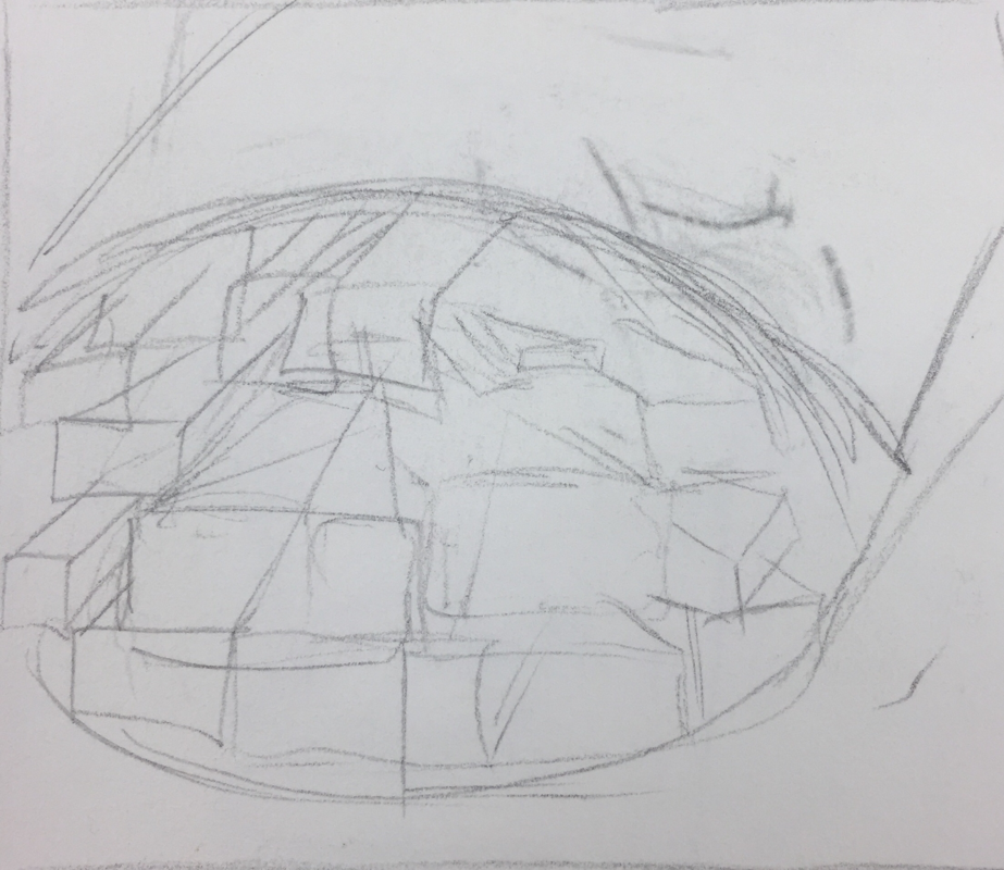
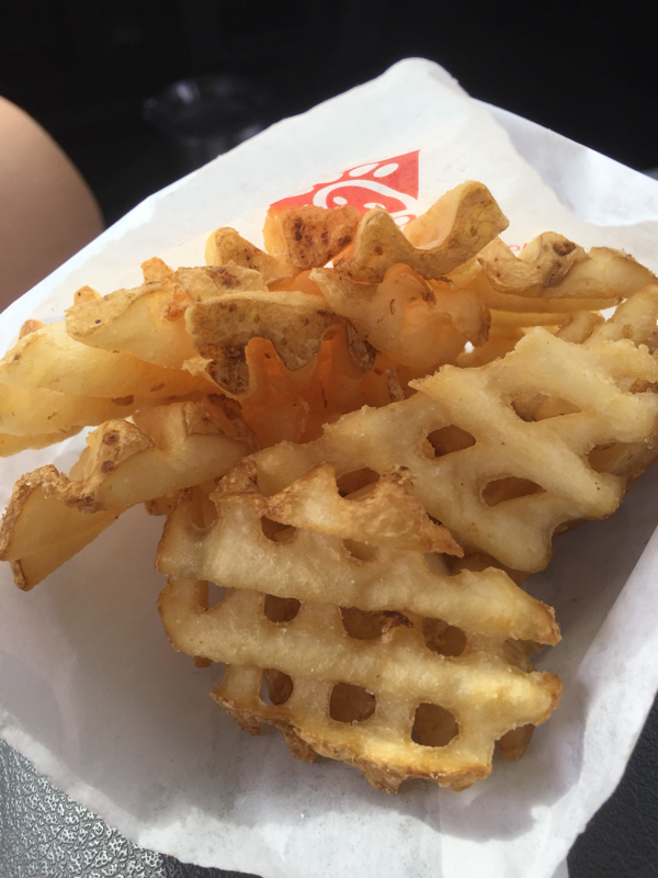
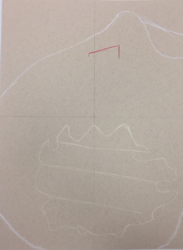
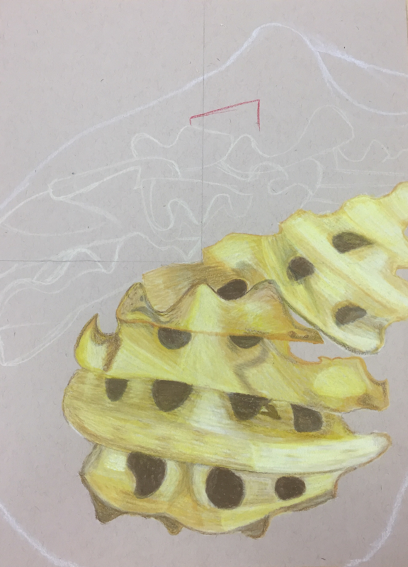
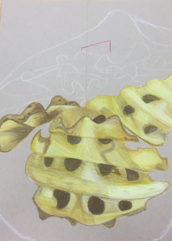
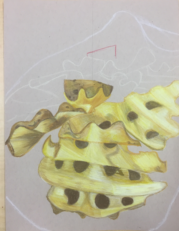
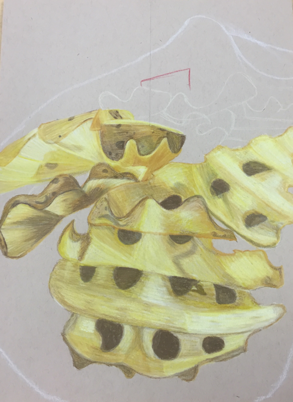
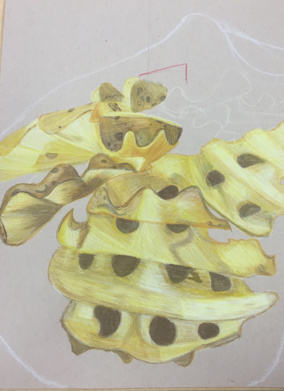
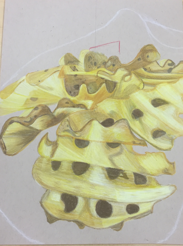
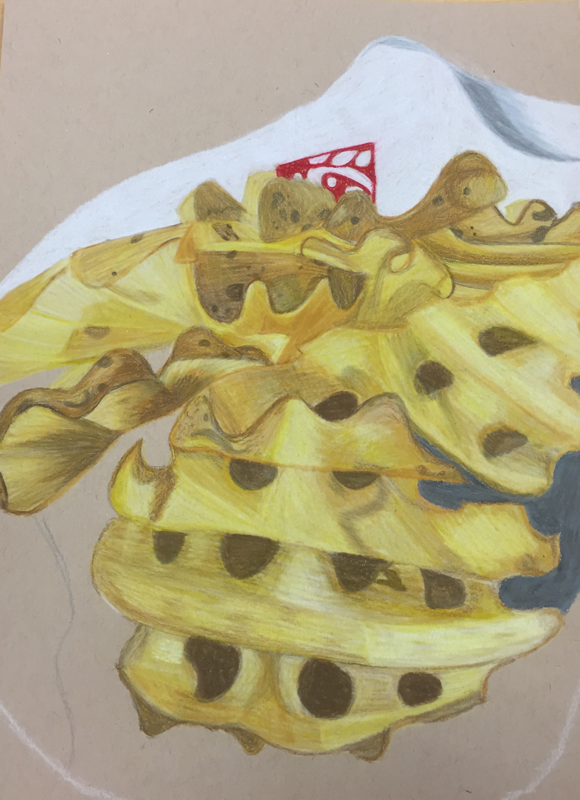
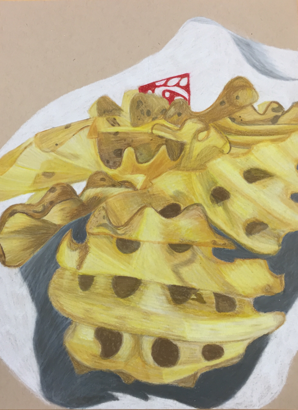
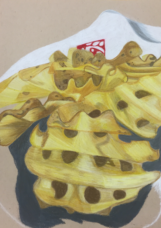
Describe how you created an interesting point of view? Was it successful? Why or why not?
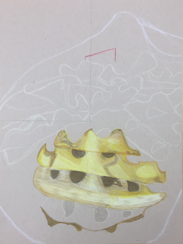
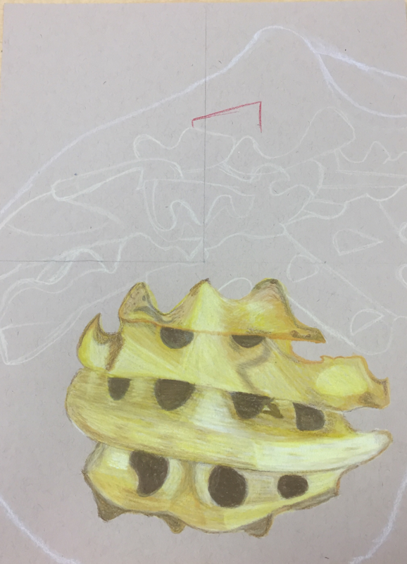
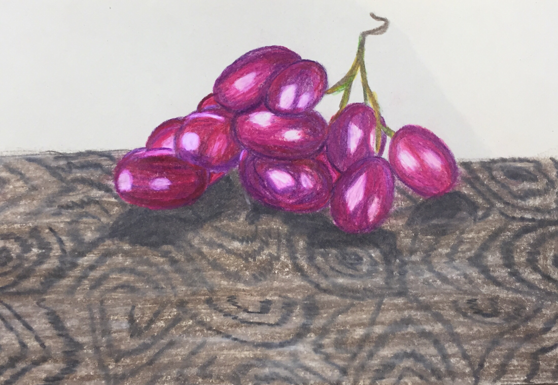
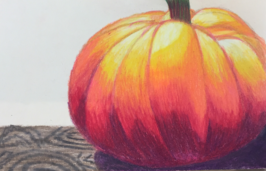
I created an interesting point of view through the photo I took, I took the photo at a downward slant and I really like the way it turned out. I think it was successful because it gave the French fries a different look and I also used waffle fries instead of straight fries, which I think also gives it an interesting point of view. Drawing waffle fries definitely made it harder but I love the way these turned out and I think using waffle fries made it unique because theres lots of foreshortening with normal French fries. Why is it important to understand perspective and how to draw it? It's important to understand perspective so that your drawing looks realistic, when you have a point of view you want everything to line up the way it would realistically. For instance if I were to draw a path of bricks I would want a view point and then draw the bricks from there, not just boxes of because then it looks cartoonish. Overall it's important to know how to draw it so it looks realistic and adds dimension to the piece. It helps add dimension because it shows how the picture was taken and whats coming forward in the picture and in the drawing. How were the colored pencil exercises important in the success of your piece? My colored pencil exercises were important because it taught me how to shade, layer, blend, and highlight each piece. For me in this project the most important thing was layering and without the pumpkin practice I don't think I would have layered these French fries correctly. I also needed to add darker yellows/browns in some places and the pumpkin practice also helped with that, so that I knew how to blend the lights into the darks. Overall without the pumpkin practice drawing I don't think my French fries would have turned out the way they did. Describe the craftsmanship of your colored pencil. What techniques were used? (How well the project is technically crafted). Some techniques I used were doing very light layers and blending. The technique I used most was really light layers, it took me over a week to finish this piece but without doing lots of layers I wouldn't have gotten the colors I did. With layering I was able to get gold tones, brown tones, and white yellows for the highlights. I also used a blending technique by layering light tones then middle tones then dark tones then taking a light tone again to blend it all out, that helped me get highlights in areas that needed highlights. I think my project is well crafted because of the colors and dimension I got in each fry, this is also my personal favorite prisma color piece I've ever done because of the colors I got in the piece. Were you able to achieve depth by showing a foreground, middle ground and back- ground? Explain. I think I was able to achieve depth by showing a foreground because the French fries take up almost all of the paper and they have a lot of depth in each one, the bag the French fries come in also have a lot of depth due to the shadow and the highlight. In the background I just did a basic background of colors that would help make the piece pop, it doesn't have as much depth but overall I think it has a fair amount to not overwhelm the piece. Explain your experience with colored pencil and the project in general. What were the obstacles and advantages? Overall I really enjoyed using color pencil for this project, I love how much dimension I got in each fry and I love the coloring I got in each fry. I also only used about four colors for each fry which I think is pretty cool and it looks like theres more than for. I also really liked the project because it was a bit more challenging then most since I just learned perspective for the first time. I didn't really face any obstacles besides making the French fries larger from the original picture. Some advantages I had was spending time on the practices to really figure out how to use prismas. Looking back on the progression of this project what skills, techniques or other information would you like to have been taught? Do you feel you were prepared for this project? I don't think I would have needed anything else to make this project better, I think everything I needed to know for this project was taught to me. I feel like I was prepared for this project and the practices we did overall really helped me to make this piece so good. Without the practices I don't think my piece would have turned out like this, so I don't think I needed to be taught anything else and I think I was prepared for this project thanks to my great teacher! The grapes and pumpkin weren’t that hard for me to draw, since I had used prismas before. I really like the way they turned out, however I wish they could have been blended more. The glass was hard for me, it was my first time drawing glass and I don’t really like the way it turns out but practice makes perfect. I really like the colors I got in it though and I think it adds a lot of dimension.
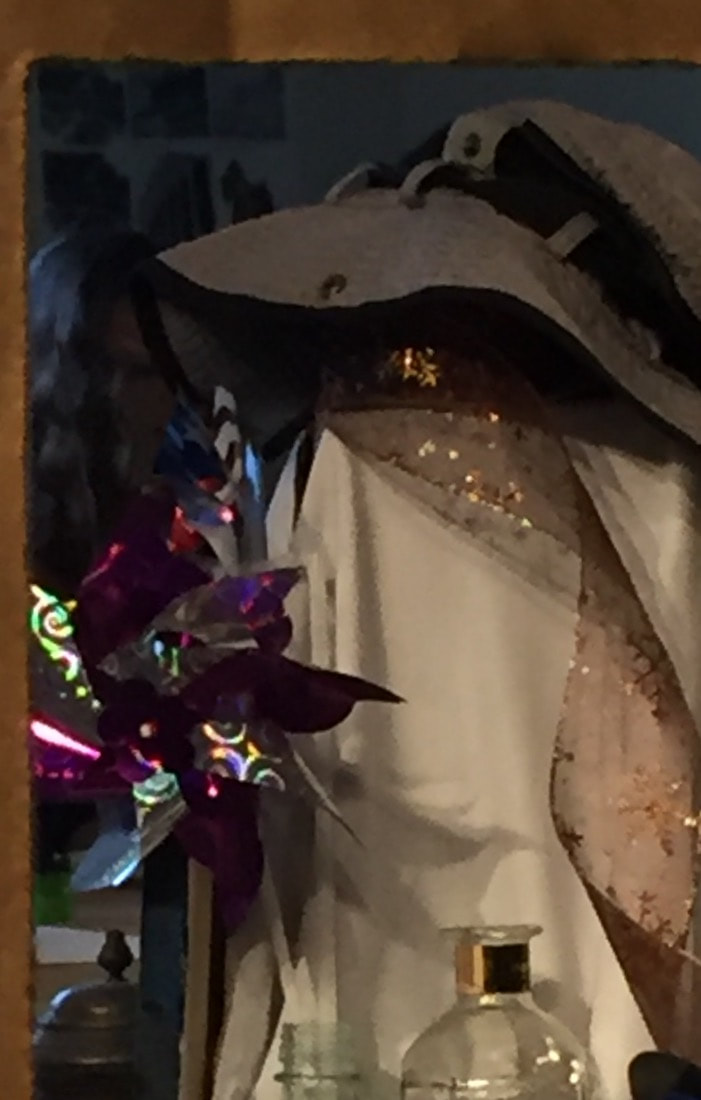
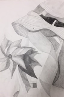
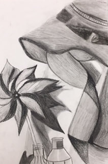
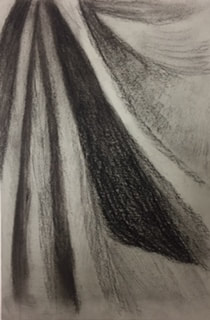
Describe the craftsmanship of your drawing. (Is it clear, clean edges, blended well, smudges, defined space, etc.)
I think the drawing is pretty clear, although I wish there was more of a difference from where the pinwheel ends and the shadow starts. The blending is ok, I think it could have been better, however part of the problem was it was originally drawn in graphite and then I went over it in charcoal. So part of the problem with the blending is because I used two different mediums and I don't think they worked well together. Are your values and shadows realistic? How many values did you include? How and why are values important? I think the values and shadows are realistic, but I think the shadows look more realistic than the values. I think the shadows look more realistic because they look pretty accurate to the picture and the real still life. The values could have looked better especially in the hat, to me the hat looks to blended and it doesn't look like it has any depth which I don't like, I wish it had more depth than it does because I think it would make the piece look more complete. Values are important because it helps add depth and dimension to a piece, it can also make the piece look more realistic. Is there a clear source of lighting? There is a clear source of lighting because the shadows are to the right which shows that the light source is coming from the left. The clearest shadows are behind the pinwheel and the ribbon, however there are lights shinning on the still life from multiple angles so realistically the shadows can from any direction. Since most the shadows are too the right I think there is a clear source of light that's coming from the left side. How important were the compositional sketches? Explain. The compositional sketches were important because it taught me how to shape the objects going off the page and how to lay them out. At first I didn't really understand how to draw the still life since its so much and you're only suppose to draw one section, but after doing compositional sketches I figured out how to place everything properly. It also helped my final piece look more realistic to the picture because everything is as close as possible to the position its suppose to be. How is your final drawing successful? My final drawing is successful because I feel that I got the positioning of the items as close as possible to the picture and actual still life. I also think that the shadows of the items are very realistic to the actual still life, and the shading is still a little light but pretty accurate to the actual piece. Overall I think its successful because of the positioning of the pieces and the shading in the pinwheel is realistic to the actual piece. Are the proportions, structure and perspective of the subject correct? I believe that the proportions are a little off compared to the picture but they're very close to being right. In the picture the pinwheel and the ribbon are a little further apart so it would have looked better if I slid the pinwheel off the page a bit more. I think the hat and ribbons perspective is very accurate to the still life, however the pinwheel is still a little off. I like the way the pinwheel looks still even though the perspective is a little off. Does the placement & grouping of objects create a pleasing arrangement (composition)? I think the grouping of the objects does create a pleasing arrangement, although it's a little hard to see that the hats on top of a box, but I think the pinwheel hat and ribbon look good together. Also all the objects are going off the page which helps add good composition, and makes the piece look more like a section of a still life rather than a full still life. Overall I think its a pleasing arrangement because everything goes off the page and you can still see what every object is. Is there a center of interest and is it well located? There's not a center of interest, however when you first look at the piece I think your eye is drawn to the pinwheel because its so dark and has more values compared to anything else. The ribbon is the second thing my eye is drawn to again because of the values, I think the hat would look better if there were more values inside the hat. If you look at the center of the page its just part of the box which is also why there's not really a center of interest. How well did you manage your time and resources throughout the process of creating this drawing? Do you see where you could improve in this area? I managed time pretty well, I think I could have been done sooner, but I put off the pinwheel for like 2-3 days cause it seemed so difficult to draw. So while I wasn't drawing the pinwheel I was shading, although that doesn't need that many days. Overall I think I managed my time well and it could have been done sooner than it was if I drew the pinwheel earlier. The only improvement I think I could make would be to not putting off drawing something cause you think its hard, just draw it and get it over with and if it doesn't look 100% you can add values and shading to make it look better. What challenges did you encounter during this project and how did you overcome them? One of the challenges I encountered was drawing the pinwheel, I've never drawn anything like the pinwheel before so it was a little difficult at first. I overcame drawing it by trying as best as I could, and just adding shading, when I was drawing it the first thing I did was draw each curve so I knew where to shade and I think that really helped. The second challenge I had was shading and making things darker, that seems to be a problem for me and I think its because I'm scared that I'll make something to dark, although the shading of the pinwheel looks really good compared to when I first shaded it. First time drawing fabric with three different mediums and three different colored papers. My favorite medium we used was the basic charcoal pencil, it was my favorite because I understood it the best. To me the White Charcoal was the hardest and I think part of it was because it was the first time drawing fabric with a white pencil. But it was the hardest because at first it kind of confused me with how your really shading the parts that are the brightest and barely shading the parts that are darkest. The white prisma fabric was my favorite but it was also the third one so I had two others to practice on. To me the white prisma looks the most realistic but it still could have had better mid tones and brighter in some areas. 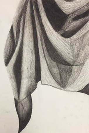 Did you use a wide range of values? (A range from white to black with at least 9 values). Explain how is this evident?
Yes, It's evident because there's mid tones through out the piece and there's shades of light and dark. There's more darker areas than lighter areas, but in between the dark and lights there's lots of grays for the in between values. I think overall there's more gray values instead of lights and darks so I think the piece would look better if there were more lights. Explain how your knowledge and creating practice studies with value contributed to your piece. I've used charcoal before, but it was freshman year and I haven't used it since. When I did the piece freshman year it was way too dark and there wasn't any mid tones or lights. Then when we first started using charcoal again I blended too much so it didn't look like it had any texture. So with practice and less blending my piece looked more realistic however there are some parts that don't look as realistic as they could be. Describe the blending and transitions in your fabric (discuss your use of pressure with pencil/colored pencil/charcoal pencil and other techniques to achieve this). In the fabric I tried to make the shadows as dark as possible and when I did that it was hard for me to make mid tones but when I did I lighted up on the pressure as I got toward lighter areas. I also used a paper towel to blend out some of the areas to make the transitions smoother because before it looked like a clear line rather than gradually getting lighter or darker. I mainly just used different pressures to achieve the shades I was looking for, it was harder for me to apply less pressure to make some areas lighter, which is why the piece is darker than it should be in some areas. Explain how your interpretation of texture is essential in capturing the look of the object. The texture of fabric is typically really smooth so when you're drawing the fabric it makes the most since to make it as smooth as possible. I think the smoother it looks the more realistic it looks because fabric doesn't look rough most the time, I tried to make the fabric look as smooth as possible with blending as little as possible. Not blending was really hard for me because I like to blend the colors and to me it looks better when you blend, however the piece looks more like graphite when you leave it alone. If you could recreate your pieces what would you do differently to enhance the final outcome? If I were to recreate the piece I would add lighter values and make the transitions a little smoother. I would also add highlights behind the darker pieces to make it look like its standing out more than it is. I think by adding highlights behind the shadows it would make the piece look more realistic than it is now and add more definition. I think by making the transitions smoother the piece would look more like fabric rather than shapes. I would also change some of the darker areas, I think some of the shadows ended up too dark and I think it would look more realistic if some of the shadows were more of grays rather than blacks. |
AuthorWrite something about yourself. No need to be fancy, just an overview. Archives
January 2018
Categories |


 RSS Feed
